Monday, 28 April 2014

Lesson 2

For our second lesson of EGD, it was very different compared to our first lesson. Instead of learning about the principles, we did more hands-on work and learnt about the software we use for graphic design and the effect of different formats.

The software we used was Adobe illustrator. A software that uses raster which brings us to the first point of raster vs vector.

                                                             (fig 1 http://www.streamlinedesign.com/images/custom/RasterVsVector.png )

Raster files uses pixels while vector files uses geometry. And like many things, there are advantages and disadvantages. For raster images shading can be used, there is photographic detail and texture, however, raster files have size limitation, less precision and takes a longer time to process. For vector files, it is vice versa where there is no size limitation, more precise and is faster to process but has limited shading and less detail than raster files.

Next we were taught on how to use the software, Adobe illustrator, and the tools in it. There are two main columns in Adobe illustrator, the toolbar and the palettes and we learnt about both and how to use them.

We embarked on a mini project to familiarise ourselves with the software and the tools throughout the lesson and i will show it to you at the end what i came up with. Our first task was to draw a triangle with the pen tool. The pen tool in adobe illustrator uses anchor points and Bézier curves to create the shape or figure. So instead of drawing three lines to make our triangle, we just had to plot three points and the lines would connect itself. Not many problems were faced here for me but of course his was a very basic task.


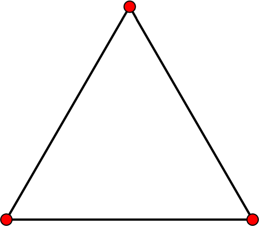
(fig 2 http://www.wpclipart.com/education/geometry/3_points_to_make_a_triangle.png )

The next tool we used on the toolbar was the selection tool which was tricky mainly because there were two. One is used for selecting and moving objects which is called the selection tool, the black cursor on the figure, while the other was to select and move anchor points which is called the direction selection tool, the white cursor on the figure.


(fig 3 http://graphicdesignertips.com/wp-content/uploads/2011/06/graphic-designer-tips-adobe-illustrator-video-tutorial-selection-tools.jpg)

Next we were taught how to use the shape tool. The shape tool is used when we need to draw out a regular shape. Instead of using the pen tool to plot various points, we could just click on the shape we want and choose the size that we want the shape to be. This tool is especially useful if we want to draw out a complicated figure such as a star for example. Also, the pen tool cannot be used to draw a perfect circle or ellipse and it is very simple with the shape tool.


(fig 4 http://blog.boxedart.com/images-vector/vec-tool.gif)

We were then taught how to use layers. Layers for me, is one of the most useful tools in illustrator. Layers is used if there are many components and parts in a design and to control what is in the front and what is in the front and the back. Also, if mistakes are found, that mistake can be easily rectified from its particular layer without disrupting and destroying any other part of the design. Also, if the designer wants to concentrate on a certain part of the design, the designer can hide the layers that he or she does not want to see.


fig 5 - (http://www.bittbox.com/wp-content/uploads/2007/08/illustrator_layer_masks_1.png)

Lastly we were taught on the certain ways to save and export different files for its various different purposes. For saving, we were generally told to use pdf format as it is saves all the vector capabilities of adobe illustrator. For exporting we were shown three main types. Jpeg, Png and Tiff. Jpeg is used for pictures and is good in compression which is good for sending. However details may be lost due to this compression. Tiff on the other hand is much bigger in size but does not lose details like jpeg. Lastly Png is very alike Tiff but is usually smaller than tiff.

Remember that little project i mentioned at the start? Using the tools and trying to learn the software, this is what i came up with, just a silly happy birthday card but many tools were used and i feel i have gained some knowledge from this software. Although i do not have the picture.

Reference have been made to (http://graphicssoft.about.com/od/graphicformats/f/summary.htm) and EGD notes on olive. All pictures are not mine and are used for reference

Saturday, 26 April 2014

Lesson 1

Today was our first lesson of essentials of graphic design (EGD). We learnt the fundamentals of graphic design and the backbone to our learning experience throughout the year. We covered 8 main principles that goes into graphic design.
1st) The first thing we learnt about was balance. Balance provides stability and structure to a design. Its the weight distributed in the design by the placement of elements. An example of balance is symmetry. In the figure below, the design is symmetrical as the words and the figure is evenly distributed on both sides.


fig.1- http://www.mchscats.org/lforsythe/DP/balance/02.gif

2nd) The second thing we learnt about was proportion. Proportion is the relationship between scale, and the environment. Proportion is used when the designer wants someone to notice a particular thing first. For example from fig 2, we would first notice the planets Jupiter or Saturn as they are the biggest, before we notice the other planets


fig. 2- http://jerrardwayne.jw-server.com/wp-content/uploads/sites/6/2014/01/graphic-design-proportion-540x180.jpg

3rd)) The third thing that we were thought was rhythm. Rhythm is the flow and can be used if we want to make the design feel smooth, easy and united. This is achieved by using a regular rhythm if we want to get that effect of a flow. With reference to fig. 3, we can see that the image has certain repetitions in the design.


fig.3 - http://www.adigitaldreamer.com/articles/images/unity-rhythm.gif

4th) The fourth thing we learnt was about dominance. Dominance is created by contrasting size, positioning, color, style, or shape. The focal point should dominate the design with scale and contrast without sacrificing the unity of the whole. (Definition taken from http://en.wikipedia.org/wiki/Design_elements_and_principles) When  When looking at fig.4, The first thing we would notice is the words "NO MORE WAR" followed by the blue text, black text, and the white text. This is so because the words "NO MORE WAR" are, colored a bright red, the biggest text and are in the middle


fig.4 - http://media-3.web.britannica.com/eb-media/06/73206-004-FC727955.jpg

5th) The third thing we learnt was about alignment. Alignment is the way in which words or pictures are placed in a certain manner. Alignment can be used in the center, left or right. fig.5 is using a left flushed alignment


fig.5 - http://www.nhsdesigns.com/images/principles/p37c.gif

6th) Contrast. There are many types of contrasts but i will use a contrast in colors as an example.  Colors is a main detail behind graphic design, colors can influence our emotions, thoughts and decision making. For example, a color like yellow which is bright and outstanding, may be used to capture our attention with its bright outlook. This principle is used in an instance where the designer may want you to notice a particular item.


fig.6 - http://designyoutrust.com/wp-content/uploads/2013/09/Self-defense-custom-t-shirt-design-by-kreadid.jpg

7th) Proximity in design is how related items are grouped accordingly( definition from - http://www.webdesignerdepot.com/2010/01/the-principle-of-proximity-in-web-design/)  Using figure 7, we can see how the stack of papers are grouped on one side on the left, and the two clocks are grouped together on the right.


fig.7 - http://pdfcast.org/data/screenshot/Proximity-Principles-of-Graphic-Design-Presentation-Transcript-30728.jpg


8th) The last thing that was emphasized is do not be afraid of white space. It is better to leave a design the way it is than cramming unimportant details into the design. The figure below clearly communicates its message without adding useless details


fig.8 - http://www.glantz.net/wp-content/uploads/Lincoln.jpg


In conclusion, our first day of Essentials of Graphic Design was an interesting one as we covered the main principles that designers have to think about before designing. Carefully plotting out and using the different principles are key to conveying the message that we want to give. Im sure throughout our journey we will to come back to this key lesson to refresh our memory and generate our ideas and honestly, I am really looking forward to what is yet to come.

Reference have been made to notes on olive. All pictures used are not mine and is used for reference.