1st) The first thing we learnt about was balance. Balance provides stability and structure to a design. Its the weight distributed in the design by the placement of elements. An example of balance is symmetry. In the figure below, the design is symmetrical as the words and the figure is evenly distributed on both sides.

fig.1- http://www.mchscats.org/lforsythe/DP/balance/02.gif
2nd) The second thing we learnt about was proportion. Proportion is the relationship between scale, and the environment. Proportion is used when the designer wants someone to notice a particular thing first. For example from fig 2, we would first notice the planets Jupiter or Saturn as they are the biggest, before we notice the other planets

fig. 2- http://jerrardwayne.jw-server.com/wp-content/uploads/sites/6/2014/01/graphic-design-proportion-540x180.jpg
3rd)) The third thing that we were thought was rhythm. Rhythm is the flow and can be used if we want to make the design feel smooth, easy and united. This is achieved by using a regular rhythm if we want to get that effect of a flow. With reference to fig. 3, we can see that the image has certain repetitions in the design.
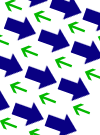
fig.3 - http://www.adigitaldreamer.com/articles/images/unity-rhythm.gif
4th) The fourth thing we learnt was about dominance. Dominance is created by contrasting size, positioning, color, style, or shape. The focal point should dominate the design with scale and contrast without sacrificing the unity of the whole. (Definition taken from http://en.wikipedia.org/wiki/Design_elements_and_principles) When When looking at fig.4, The first thing we would notice is the words "NO MORE WAR" followed by the blue text, black text, and the white text. This is so because the words "NO MORE WAR" are, colored a bright red, the biggest text and are in the middle

fig.4 - http://media-3.web.britannica.com/eb-media/06/73206-004-FC727955.jpg
5th) The third thing we learnt was about alignment. Alignment is the way in which words or pictures are placed in a certain manner. Alignment can be used in the center, left or right. fig.5 is using a left flushed alignment

fig.5 - http://www.nhsdesigns.com/images/principles/p37c.gif
6th) Contrast. There are many types of contrasts but i will use a contrast in colors as an example. Colors is a main detail behind graphic design, colors can influence our emotions, thoughts and decision making. For example, a color like yellow which is bright and outstanding, may be used to capture our attention with its bright outlook. This principle is used in an instance where the designer may want you to notice a particular item.
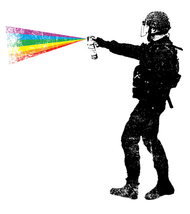
fig.6 - http://designyoutrust.com/wp-content/uploads/2013/09/Self-defense-custom-t-shirt-design-by-kreadid.jpg
7th) Proximity in design is how related items are grouped accordingly( definition from - http://www.webdesignerdepot.com/2010/01/the-principle-of-proximity-in-web-design/) Using figure 7, we can see how the stack of papers are grouped on one side on the left, and the two clocks are grouped together on the right.
fig.7 - http://pdfcast.org/data/screenshot/Proximity-Principles-of-Graphic-Design-Presentation-Transcript-30728.jpg
8th) The last thing that was emphasized is do not be afraid of white space. It is better to leave a design the way it is than cramming unimportant details into the design. The figure below clearly communicates its message without adding useless details
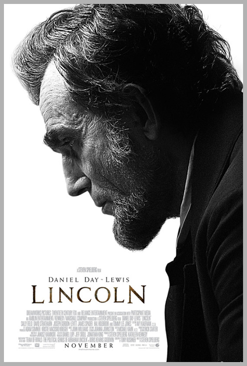
fig.8 - http://www.glantz.net/wp-content/uploads/Lincoln.jpg
In conclusion, our first day of Essentials of Graphic Design was an interesting one as we covered the main principles that designers have to think about before designing. Carefully plotting out and using the different principles are key to conveying the message that we want to give. Im sure throughout our journey we will to come back to this key lesson to refresh our memory and generate our ideas and honestly, I am really looking forward to what is yet to come.
Reference have been made to notes on olive. All pictures used are not mine and is used for reference.
No comments:
Post a Comment