We started off with learning exactly how to grab the attention of the audience. Basically if an advertisement is made, we would want people to notice it and therefore an advertisement design has to be attention grabbing. There are a number of ways to grab the attention of the target audience such as playing catchy music, A beautiful woman, repetition, loud sounds and visual humour.
A few examples i have found;

fig.1 - http://files.coloribus.com/files/adsarchive/part_1169/11691105/file/olympus-binoculars-koala-small-68318.jpg
This advertisement uses visual humour to send its message. It is implying that something so far seems so near thanks to olympus binoculars, the product it is selling.

fig 2 - http://goaldrivenwomen.com/wp-content/uploads/2014/03/sexyCar.jpg
Using the beautiful woman at the front to catch the attention of the viewer. The car will get the attention of the viewer even though it may not be the first thing they notice.
A design also needs to be trustworthy. In the advertisement, we would want to show the audience that this product or brand is trustworthy.

fig 3 - http://www.forodefotos.com/attachments/fotos-de-futbolistas/26541d1321844127-fotos-con-cristiano-ronaldo-cristiano-ronaldo-shampoo-afiche.jpg
For example in figure 3 above, the company uses a celebrity, Cristaino Ronaldo to show that it is trustworthy as people would feel that since a celebrity is using the product, it is a good one.
An advertisement has to have positive associations to show that the product is a good one and makes is a positive one to have.

fig 4 - http://www.brandchannel.com/home/image.axd?picture=2012%2F3%2Fhappy_meal_web3.jpg
In the happy meal advertisement in fig 4 above, it shows a mother and daughter smiling while consuming the happy meal. This sends a positive vibe to the viewers.
Advertisements can also be used to call for an action to be made.

fig 5 - https://depaul.digication.com/files/M6742813527d81c20d1d23fabdeb6d891.jpg
''Smoking kills" A very strong advertisement in figure 5. It is showing smoking kills and using a gun to depict this statement. The intended action that the advertisement wants to give is to stop smoking.
An effective advertisement does not necessarily need text or many words to spread their message. Studies have shown that more attention goes into pictures than words.

fig 6 - http://www.creatividads.com/wp-content/uploads/2011/06/internet-gratis-mcdonalds-wi-fi_anuncio_3.jpg
The McDonald's advertisement does not need any words to send the message it wants. It shows there is free wifi and of course food by using french fries.
Layout in advertisements is crucial. The advertisement should have a focal point which is the main point, followed by the white space, graphic and text.

fig 7 - http://www1.icsi.berkeley.edu/~stellayu/artvis/homework/page/kavanaky/good2.jpg
This advertisement in fig 7 has a great layout. The focal point is the drink, the space, text and graphic is also very well placed.
Earlier i talked about how some designs we have learnt about uses only pictures and graphics. The opposite is also present where just words are used.

fig 8 - http://www.topdesignmag.com/wp-content/uploads/2011/04/think-mobile.jpg
The words used and the style which figure 8 uses them is brilliant in my opinion. Its message is depicted clearly yet even though it is all in words, we feel curious to read them when the advertisement puts it in this way.
Mainly i have been only talking about the good designs i have seen and learnt about but however there are a few bad designs as well.
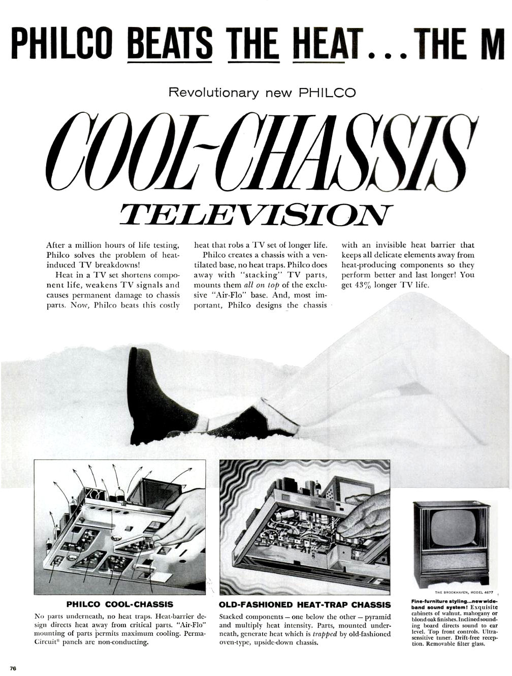
fig 9 - http://www.antiqueradio.org/art/PhilcoH3412LLifeMagazineAdJan181960.jpg
The advertisement in figure 9 is no good as it does not have any proper layout, there is no focal point and there is an overload of information.

fig 10 - http://assets.nydailynews.com/polopoly_fs/1.1050011.1332626409!/img/httpImage/image.jpg_gen/derivatives/gallery_635/.jpg
The picture in fig 10 is a bad advertisement because of the words "keep her where she belongs" which is confusing as the advertisement shows a shoe and a woman. It is quite unclear which are they refering to.
In conclusion, for lesson 5 it was a very informative session to me and i learnt a lot about the Do's and Don'ts of advertisement designs. There are many ways to get the message you want to send across and it is not necessary to cram every element into the design.
Reference have been made to notes on olive.
All pictures used are not mine and is used for reference.
No comments:
Post a Comment