Four basic elements have to be in a print advertisement. They are visual, headline, body copy and logo. These elements should be put together in a simple way to convey its message clearly and achieve its goals.
For example the nike shoe advertisement below has all four elements and are put together very well.

fig 1 - http://www.pinoyfitness.com/wp-content/uploads/2012/01/nike-ad-blog.png
Symmetric and asymmetric designs were also shown. The first design is symmetrical while the second one is asymmetric.

fig 2 - http://ashleemeredith.files.wordpress.com/2013/01/6f5ac6e45f4f4a71ea22145a52c34866.jpg
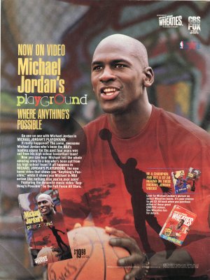
fig 3 - http://s.ecrater.com/stores/146213/4b7e069e5fe0f_146213n.jpg
We also recapped contrast. For example using contrasting colours.

fig 4 - http://cmrolf72.files.wordpress.com/2012/11/contrast.jpg
We then moved to some advanced strategies in design. The golden rectangle was introduced to us. What the golden rectangle is saying is try to put the main message or visual as the focal point and allow the design to have a flow like the advertisement below.

fig 5 - http://www.graphicsbeam.com/wp-content/uploads/2011/11/Listerine-ad-1-520x724.jpg
An advertisement should also be exciting and stand out. This can be done with colours

fig 6 - http://img.uuhy.com/uploads/2010/08/394-advertising.jpg
Lastly we covered photo design strategies. Photos used should have a central point of interest that link together to deliver its message. Lighting and background is vital to get desired the desired outcome. The advertisement below is an example of good photo design.

fig 7 - http://www.indiaonrent.com/forwards/b/best-ads-save-water-save-life/res/9x03pq.jpg
In conclusion, layout is vital in design and we have been told about this since day one, we learn a few more strategies to get a better layout for our design when it is time for our project.
No comments:
Post a Comment